feel the heat - part 2...

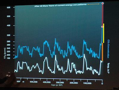
A couple of emails sent to me suggest that I need to explain the graph in the previous item a bit further, so I've amended Al Gore's graph (above) to highlight two things:
(1) The Orange Line: What will happen in the the next few years, when the global temperature plays catch-up with the current atmospheric CO2 levels.
(2) The Yellow Line: What will happen to the global temperature if CO2 levels reach the "After 45 More Years" mark on Al's graph.
Note: Read these new lines as an extension of the white line (it's easy to confuse them with the blue line.)
Hope this makes things clearer.
(Whilst we're on the subject of emails, I've lost all my pre-upgrade emails and email addresses ['cos I'm stoopid!] so unless you email me again, I don't have your email address anymore.)


0 Comments:
Post a Comment
Subscribe to Post Comments [Atom]
==========
<<<<< Home
==========